Tribal Credit
(
2023-2024
)
Mobile app redesign

Role
Product Designer
Timeline
Oct 2023 - Jan 2024
Team
1 PM, 1 Engineer, 1 Designer
Context
Tribal is a B2B fintech company that provides corporate cards, credit lines, and expense management solutions for mid-sized companies across LATAM and the MENA region.
In this project, I led the redesign of the Tribal mobile app dashboard and main navigation with the explicit goal of increasing mobile app usage — directly impacting credit line utilization, transaction volume, and revenue.
Problem
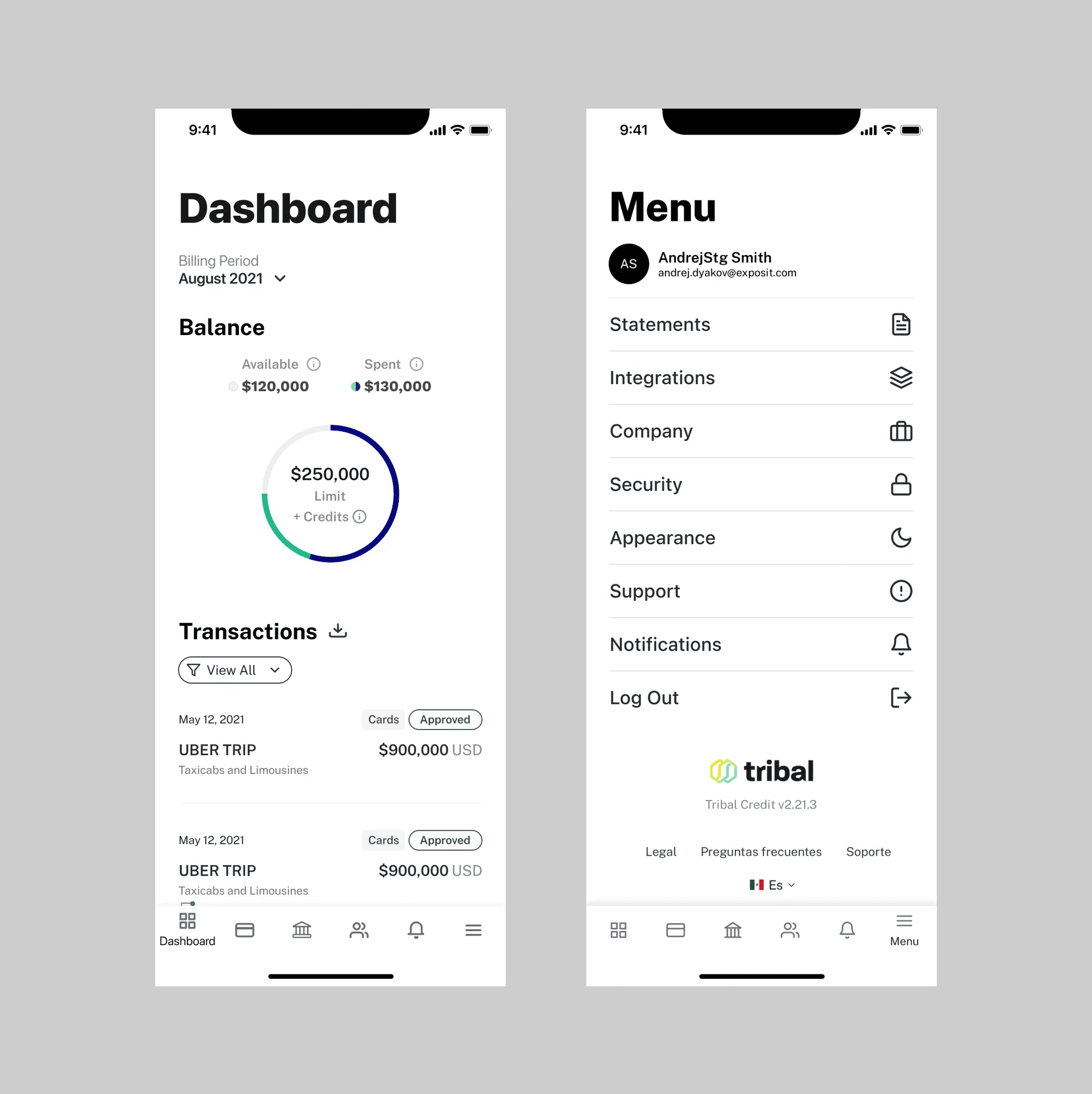
Through product analytics and conversations with Customer Support, we identified a clear pattern: users were not using the mobile app as intended.
Mobile usage was low, and feedback pointed to frustration when completing key actions. This is a problem to the business because low mobile usage limited how and when customers spent their credit line, directly impacting transaction volume and revenue.
Research
To understand the root causes behind these behaviors, we partnered closely with Customer Success and conducted qualitative research with managers and employees who regularly used Tribal on mobile.
Methods:
5 usability testing on existing mobile flows
7 user interviews across finance, operations, and leadership roles
Review of support tickets and recurring complaints
What we learned:
Users needed to perform too many taps to complete essential actions
Key features were difficult to find or inconsistently placed
Users expected the app to behave more like a modern banking app, where actions and balances are immediately accessible
These insights highlighted that the issue was not feature availability, but interaction cost and navigation clarity.
Opportunity
Based on research, we asked ourselves:
How might we reduce the time and effort required to complete essential actions?
How might we surface important and new features without overwhelming users?
How might we simplify navigation so users always know where to go?
From these questions, we formed a clear hypothesis:
If we reduce interaction cost and create a predictable, action-first mobile experience, users will feel confident relying on mobile for frequent, day-to-day spending — increasing card usage and on-the-go payments, driving higher transaction volume and healthier credit line utilization.
This hypothesis helped us align design, product, and engineering around a single principle: optimize mobile for speed and confidence in real spending moments.
Design Approach
Rather than layering new features on top of existing patterns, we focused on simplifying and restructuring the core experience.
Prioritizing high-frequency actions over secondary information
Grouping related features into a single, predictable destination
Creating a clearer visual and interaction hierarchy
Ideation & Exploration
Before moving into high-fidelity execution, we explored multiple directions to validate the right approach for mobile.
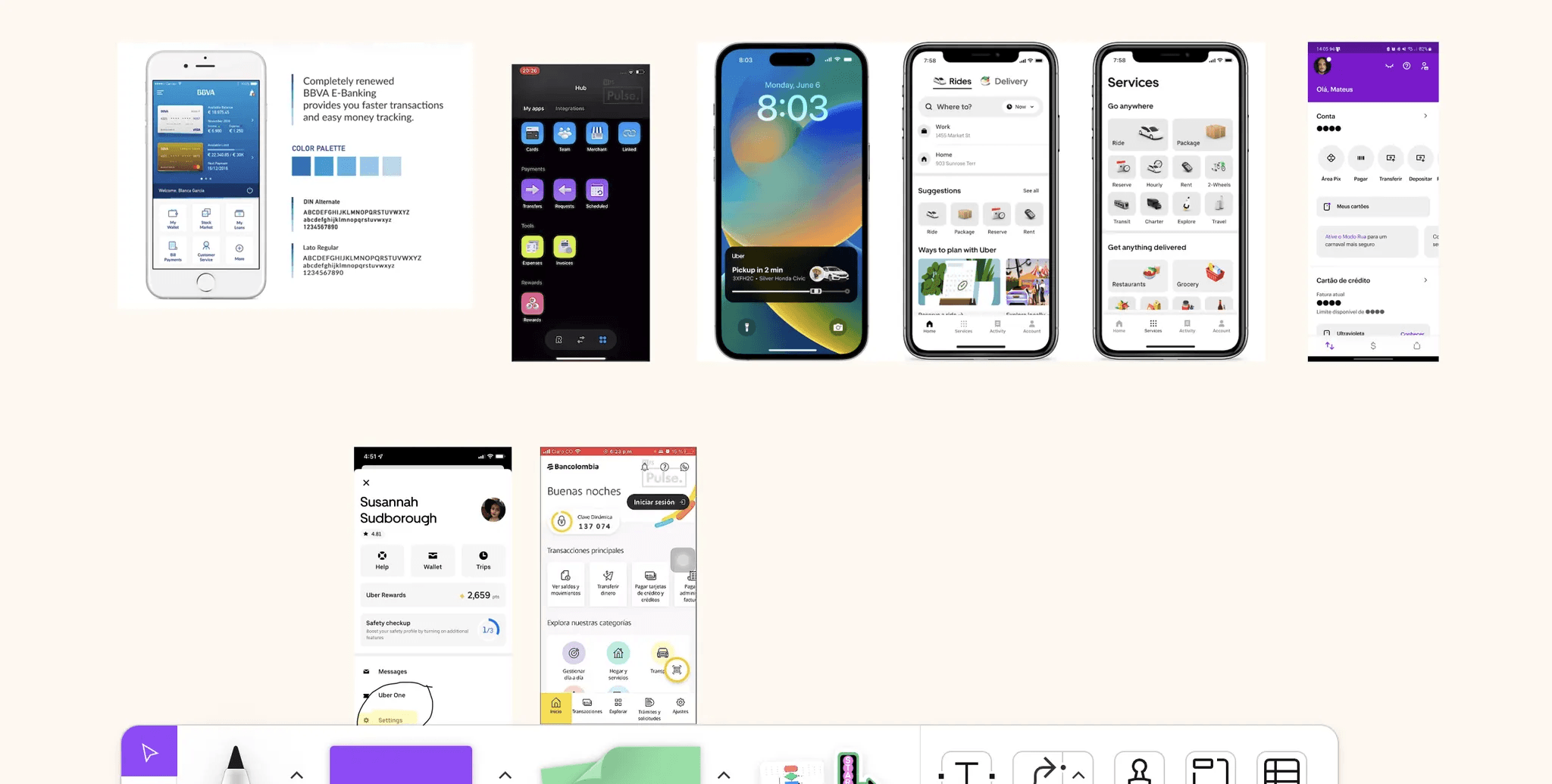
Competitive & comparative research
Analyzed mobile banking and fintech apps to understand common patterns for balances, cards, and quick actions
Identified expectations around speed, hierarchy, and action placement that users already trusted
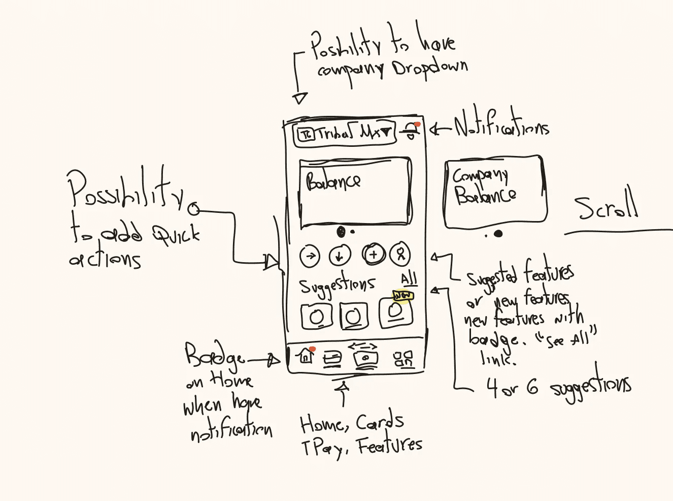
Sketching & early concepts
Early explorations
Solution
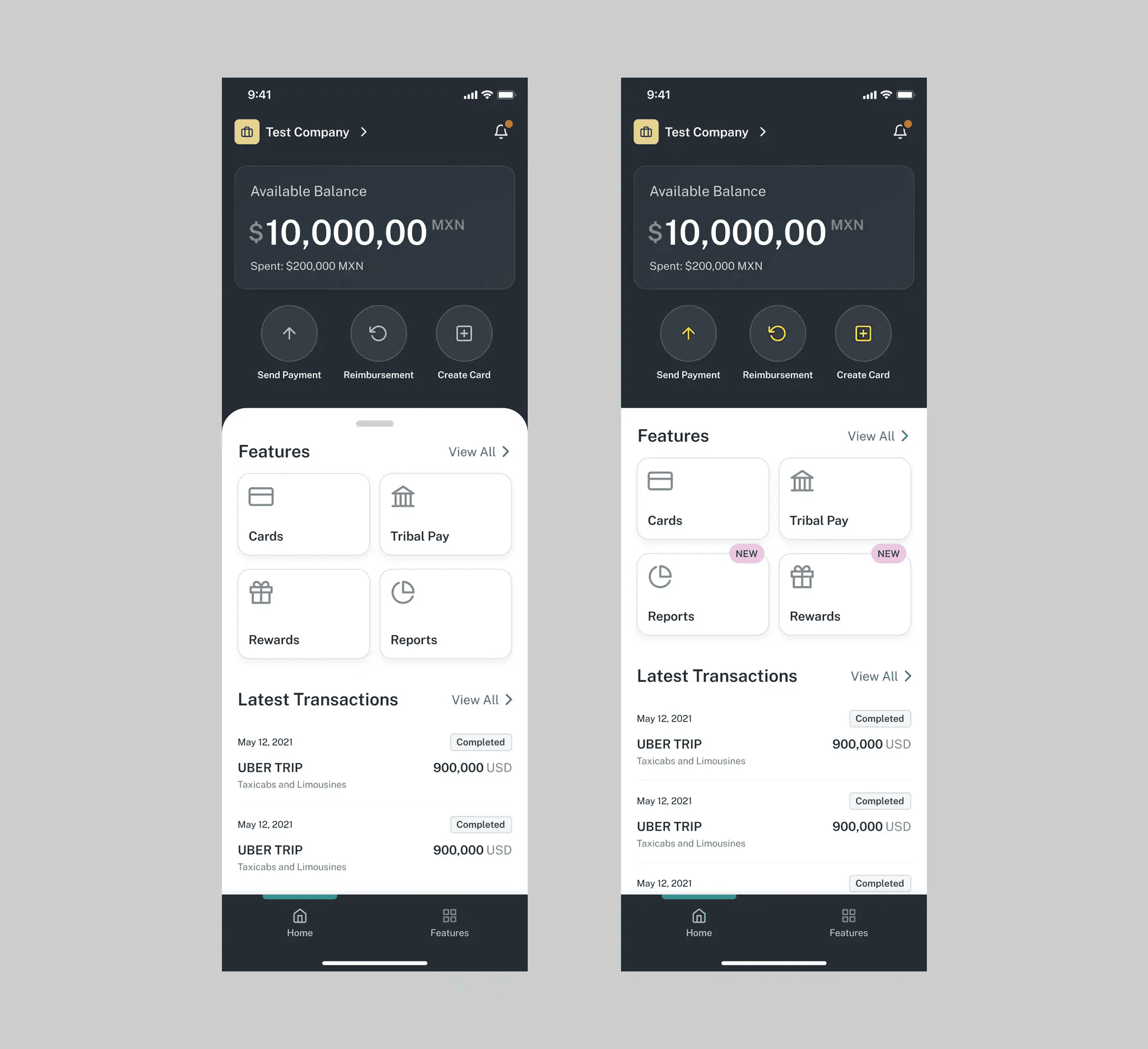
The redesign transformed mobile into a fast, action-first experience that users trusted for real-world spending — driving higher card usage, increased transaction volume, and healthier credit line utilization.
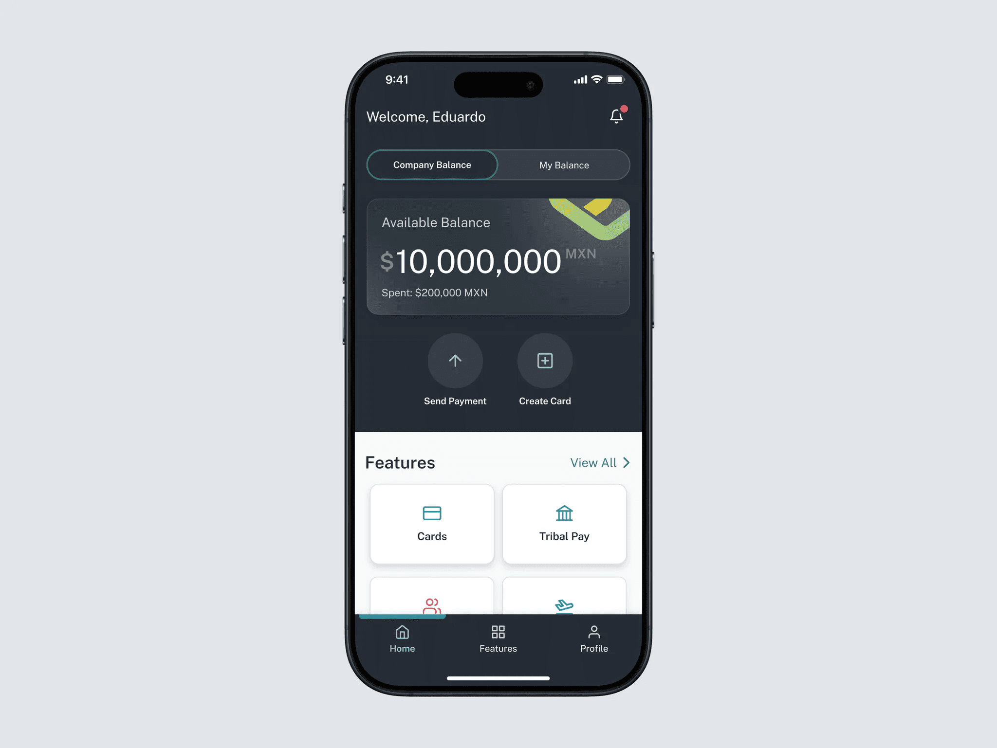
Simplified dashboard
Redesigned the dashboard to surface essential information and actions upfront, reducing cognitive load and time-to-action.
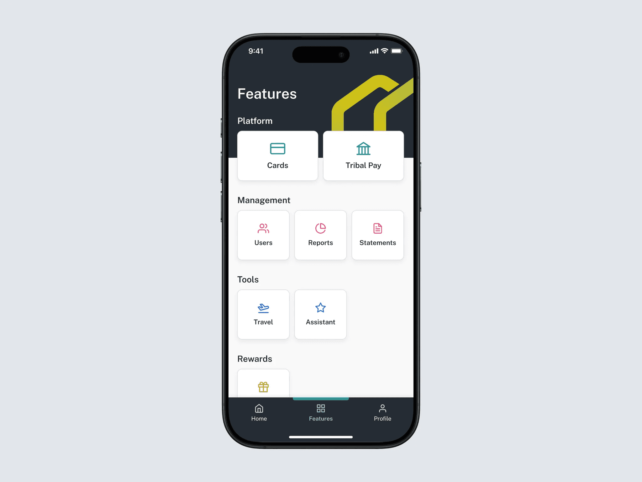
Clear, centralized navigation
Introduced a streamlined navigation structure that reduced the number of tabs and created a central hub for accessing features.
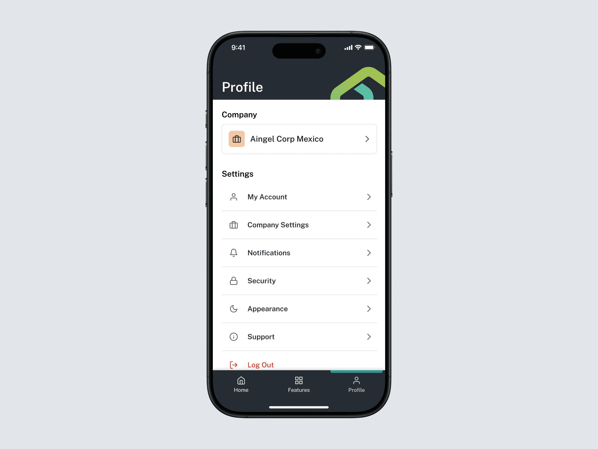
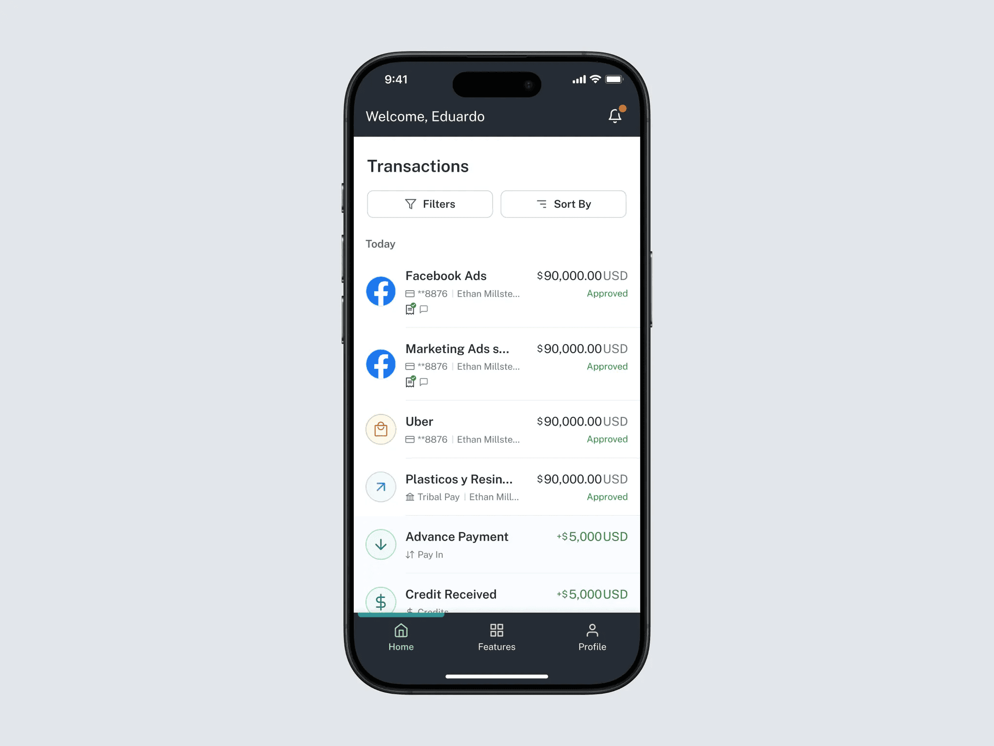
Improved visual clarity
Refined layout, spacing, contrast, and labeling to improve scannability and align the mobile experience with Tribal’s web products and brand.
Tradeoffs & Constraints
The redesign had to work within a set of technical and organizational constraints:
The existing app was built in React Native, which limited some custom interactions for the first release
The mobile app was not yet using the new design system, so we identified and standardized patterns that could be adopted progressively
Backend enrichment for transaction data took longer than expected, so V1 launched without merchant logos or icons
Given these constraints, we focused V1 on improving clarity, hierarchy, and core flows, while designing scalable patterns that could be enhanced in future iterations.
Impact
Within the first four months after release, the redesign delivered clear improvements:
Card usage through mobile increased ~30%, as users began relying on the app for real-world spending moments
Transaction volume grew ~25%, driven by more frequent mobile-initiated actions
Credit line usage became more distributed, shifting from a few large monthly payments to more regular spend
© 2026 Eduardo Reyes
