Eduardo Reyes
Product Designer
B2B Fintech Platform
(
2026
)
Designed the entry point that turned a credit tool into a business analysis platform

Role
Lead Product Designer
Timeline
Feb - March 2026
Overview
The company was a B2B financial platform for growth-stage founders set out to become the financial command center to understand and manage the health of their business. Credit, banking, bill pay, and treasury, all in one place. But usage data revealed a gap between that goal and reality: 70% of users were opening the platform 1 to 2 times a month, making a credit payment, and leaving. Everything else was invisible.
I led the design of the home experience, a place where founders can quickly answer the question: How is my business doing? Is there anything I need to do? As the sole designer, I own the end-to-end process from research to handoff to engineers and release. Shipped in 3 weeks.
Problem
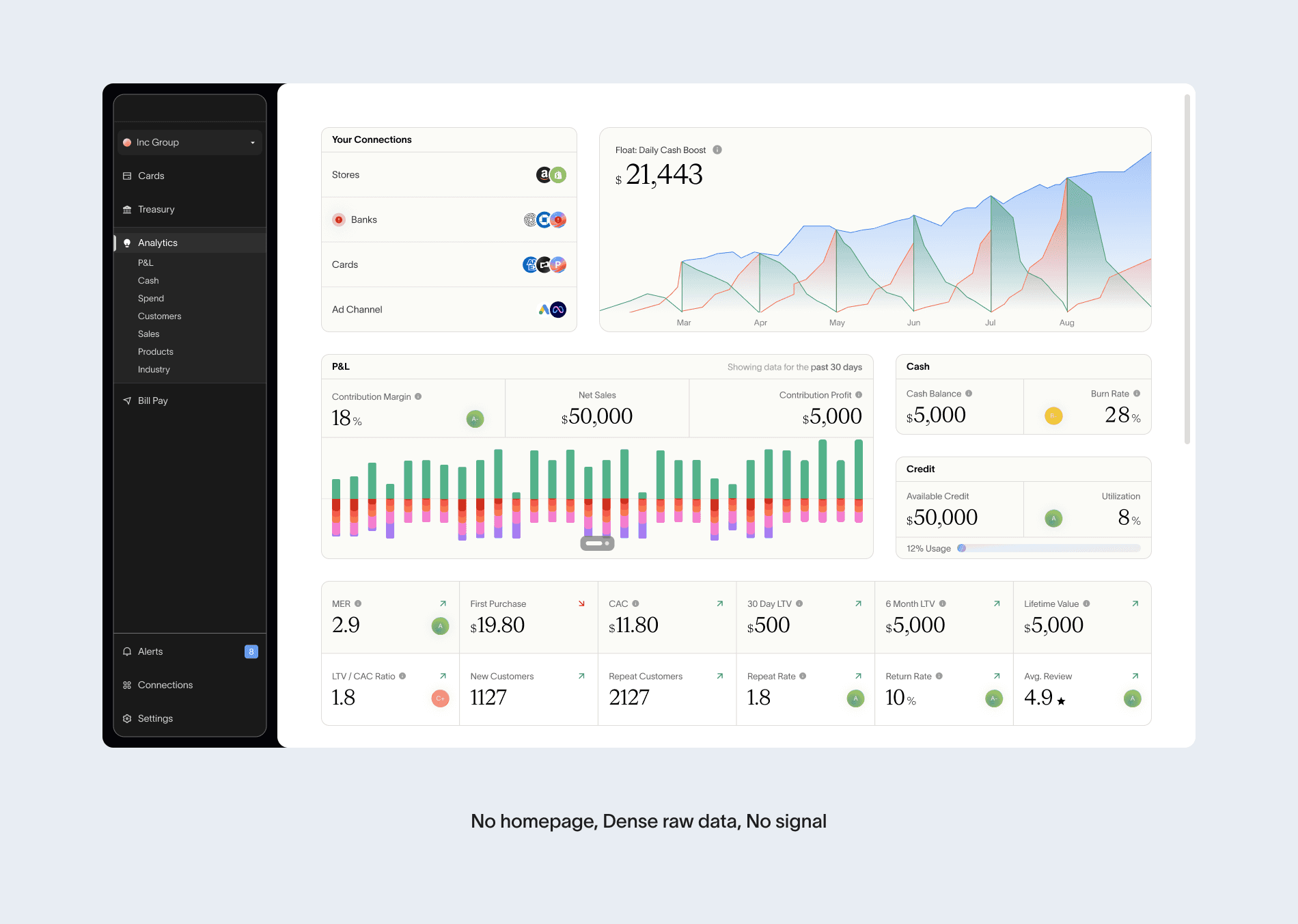
While reviewing platform performance, we identified that credit was being used but overall platform usage was low. Users were logging in 1 to 2 times a month, making a payment, and leaving. Features like analytics and banking were going completely untouched.
This directly affected the business goal of becoming the financial tool founders use to analyze their business. The platform already had everything they could need, but none of it was being used.
That raised one question: if we have all the features founders need to understand their business, why are they only coming in for 2 payments a month?
Research
To answer this question, rather than starting from scratch with traditional interviews, I made the decision to mine what we already had — 50 customer success transcripts, 35 recorded calls, and an active Slack support channel. The dataset was there. Running a new round of interviews would have taken weeks we didn't have, and risked asking questions we already had answers to.
I used AI to process the full dataset and surface patterns across sources — something that would have taken weeks manually and introduced the risk of cherry-picking insights. The goal was signal at scale, fast.
Two patterns came back consistently across every source:
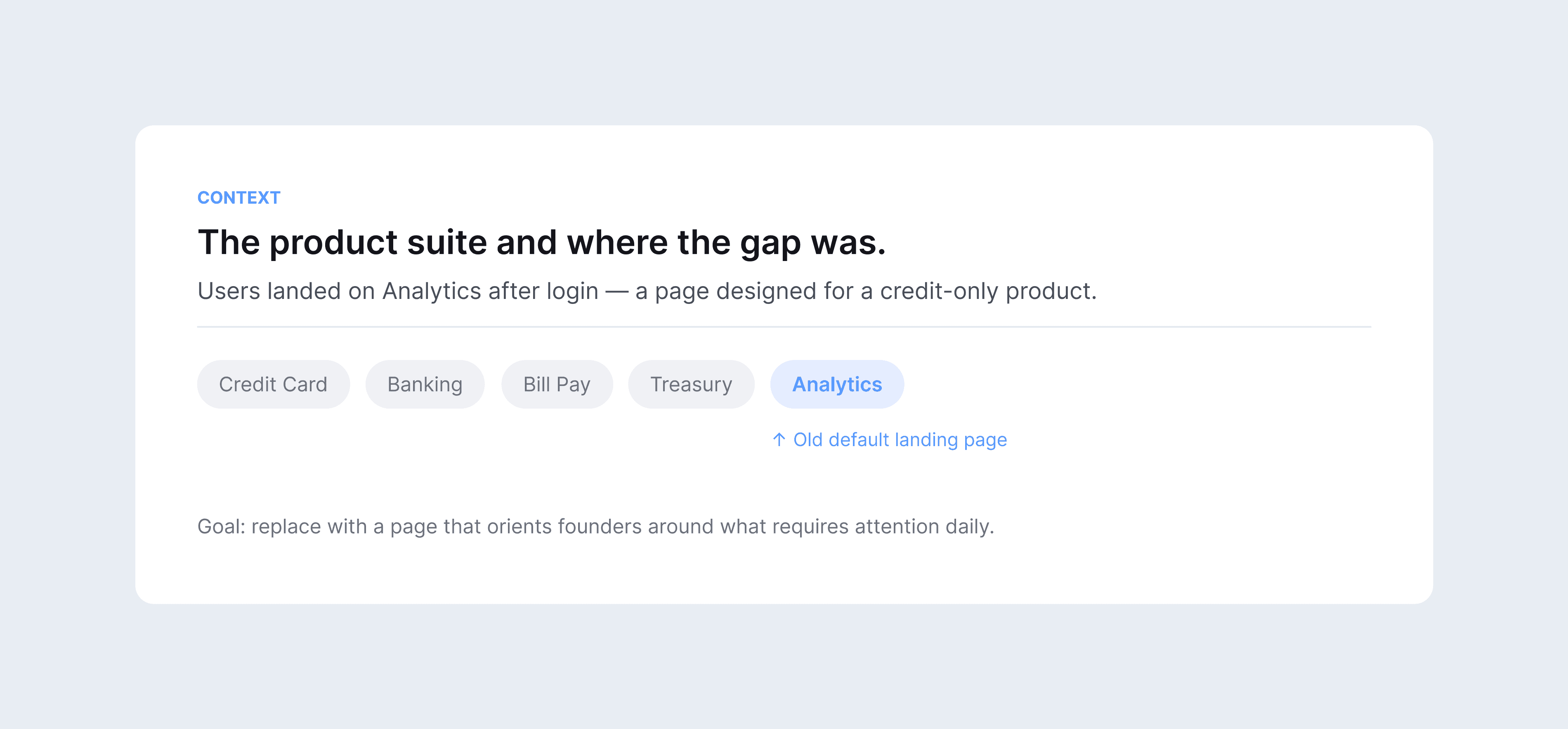
Founders lacked a clear starting point when they logged in. They landed on analytics, saw raw data with no hierarchy, and defaulted to the one surface that felt immediately actionable: credit cards and payments.
Four data points kept appearing across sources — credit limit, available cash, pending actions, and top spend. Founders were already tracking all four, just outside the platform.
This lead us to generate the following hypothesis:
If we surface the identified 4 modules as the first thing founders see when they log in, it will signal action and insights — shifting the platform's usage from 1 to 2 payments per month into a daily financial habit.
The right problem, the wrong solution
At the time, AI was already on the roadmap as a platform-wide direction, and leadership wanted to explore how to layer intelligence across the product. It made sense to ask: if founders needed better signals, could AI be the mechanism that generated those insights dynamically as the first thing they see when they log in?
We built a quick prototype to pressure-test the concept. What it revealed was the problem: founders still had to know what to ask. The agent was smart, but it put the cognitive load back on the user. We brought that tension to leadership.
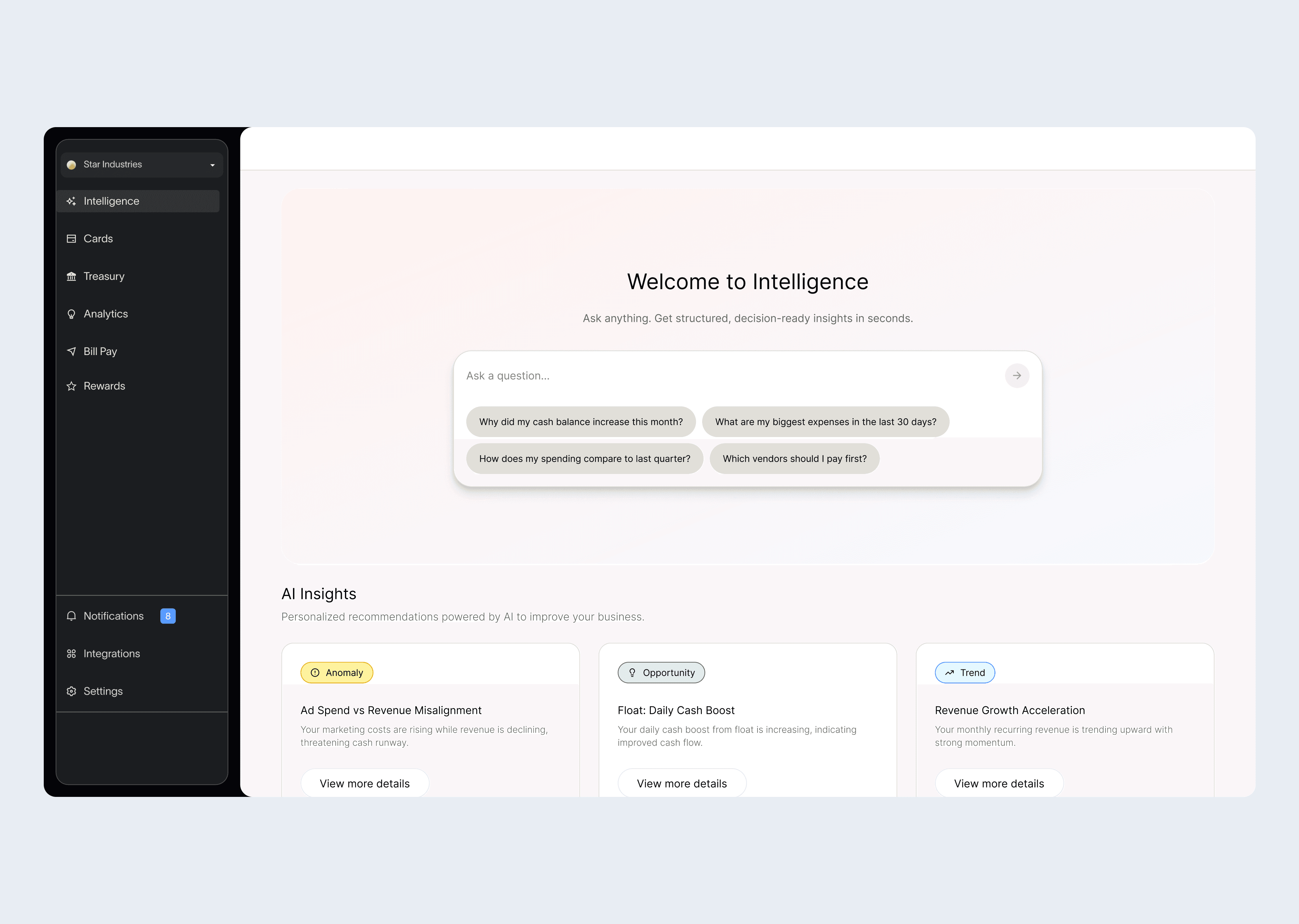
The feedback sharpened the thinking: the faster founders could access the information they needed, the better. That pushed us to ask a harder question — not what can we build, but what does a founder actually need to know in the first 30 seconds of logging in?
That reframe changed everything. Instead of a tool founders had to query, we designed a surface that answered before they asked. A homepage that said: here is your credit position, here is what needs your attention, here is where your money is going.
The AI agent would have been a feature. The homepage became the product.
Arranging the signals: what comes first and why
The four modules came directly from the AI analysis, but their arrangement didn't. Once we had the signal, the next question was: in what order does a founder need to see this information?
We validated the structure with Customer Success and Sales using raw wireframes.
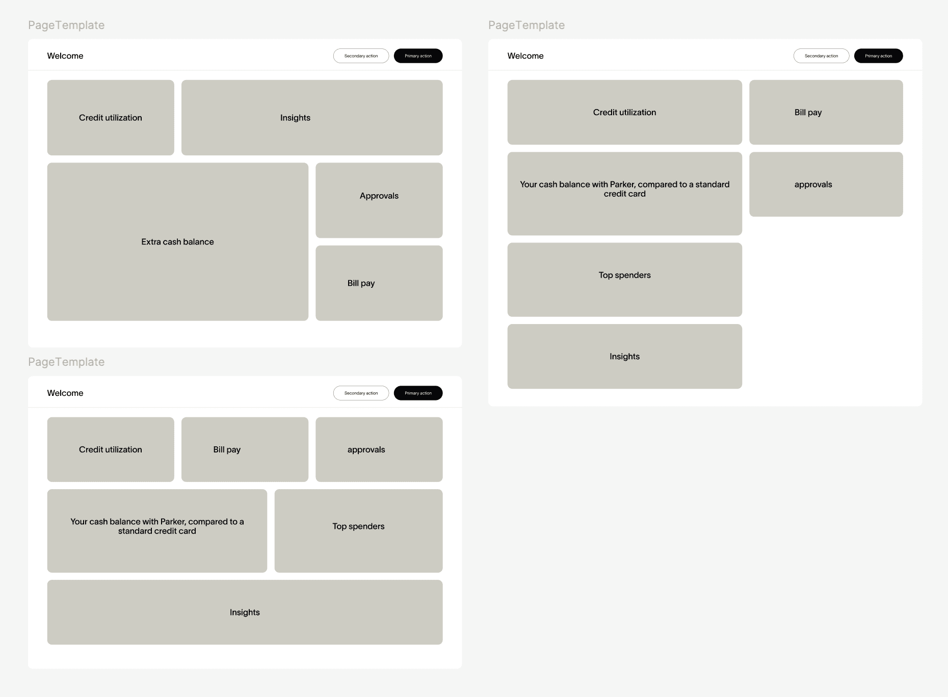
Two things came back clearly:
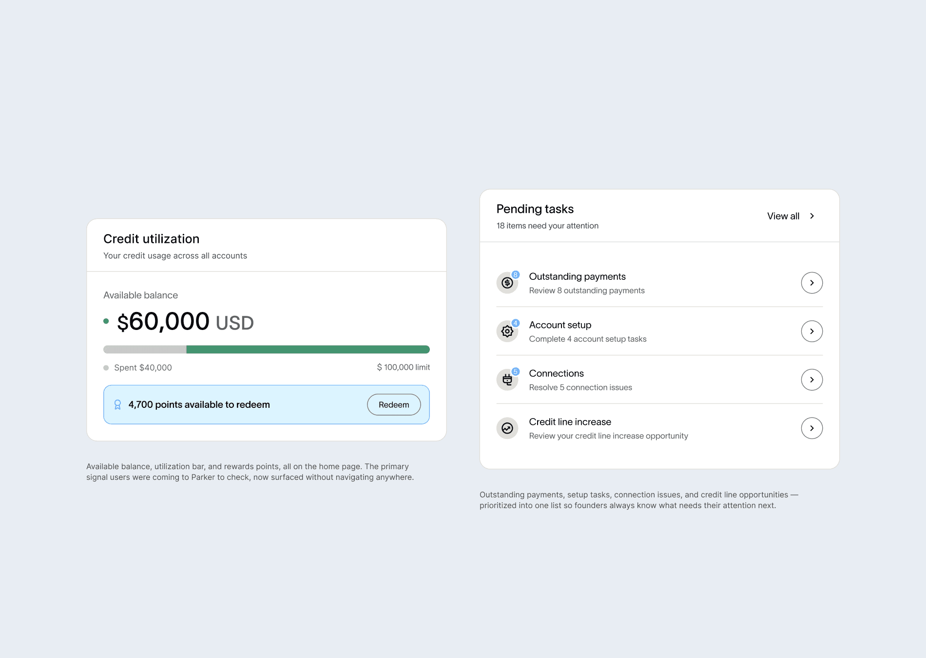
Credit limit comes first. Credit is the anchor of the relationship — it's what founders think about first when they log in.
Pending tasks on the right. Action items on the right created a natural left-to-right reading flow — from financial state to required action.
In addition, we made a deliberate decision to keep the homepage simple. This was the first dashboard the platform had ever had. Adding complex modules would have clustered the view and pulled founders in too many directions at once. The goal was a quick scan, clear signals, and immediate action. Every module that didn't serve was cut.
We also explored and discarded an earlier direction before landing on the final layout. Below an early exploration of the simple layout approach:
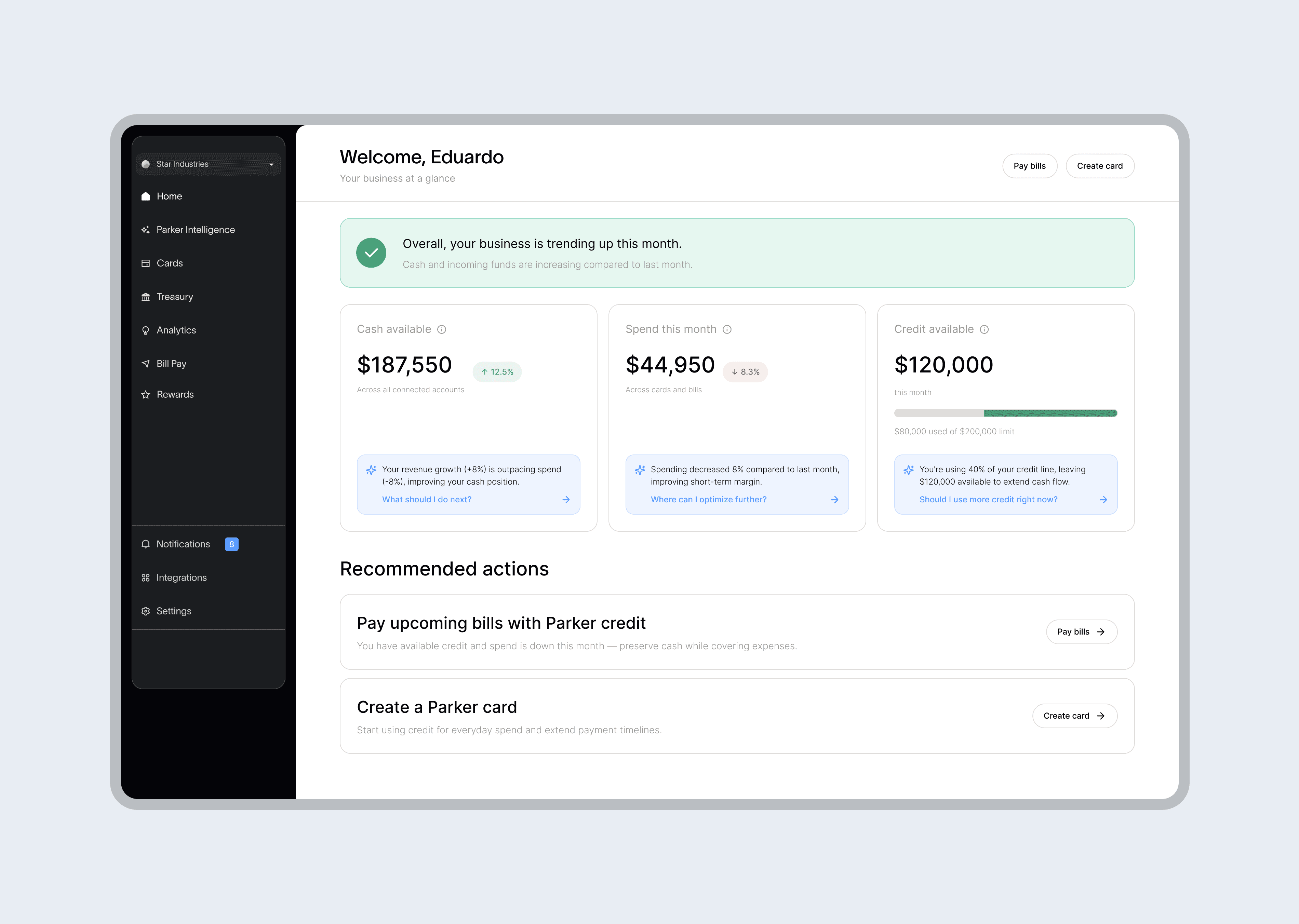
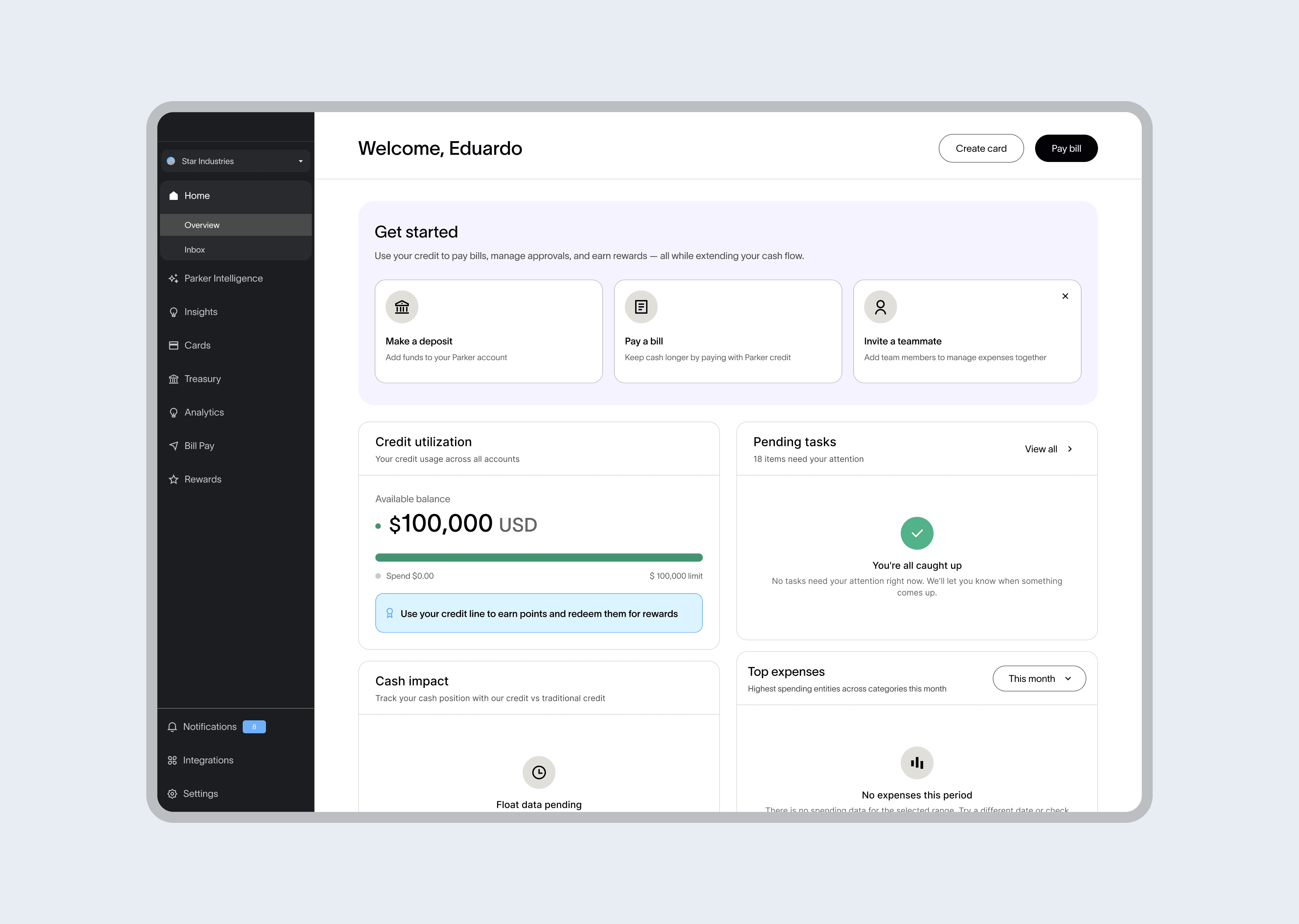
The new home page
A new entry point with every module mapped to a signal founders were already tracking elsewhere. A single view that orients them to their business before going deeper into any product area.
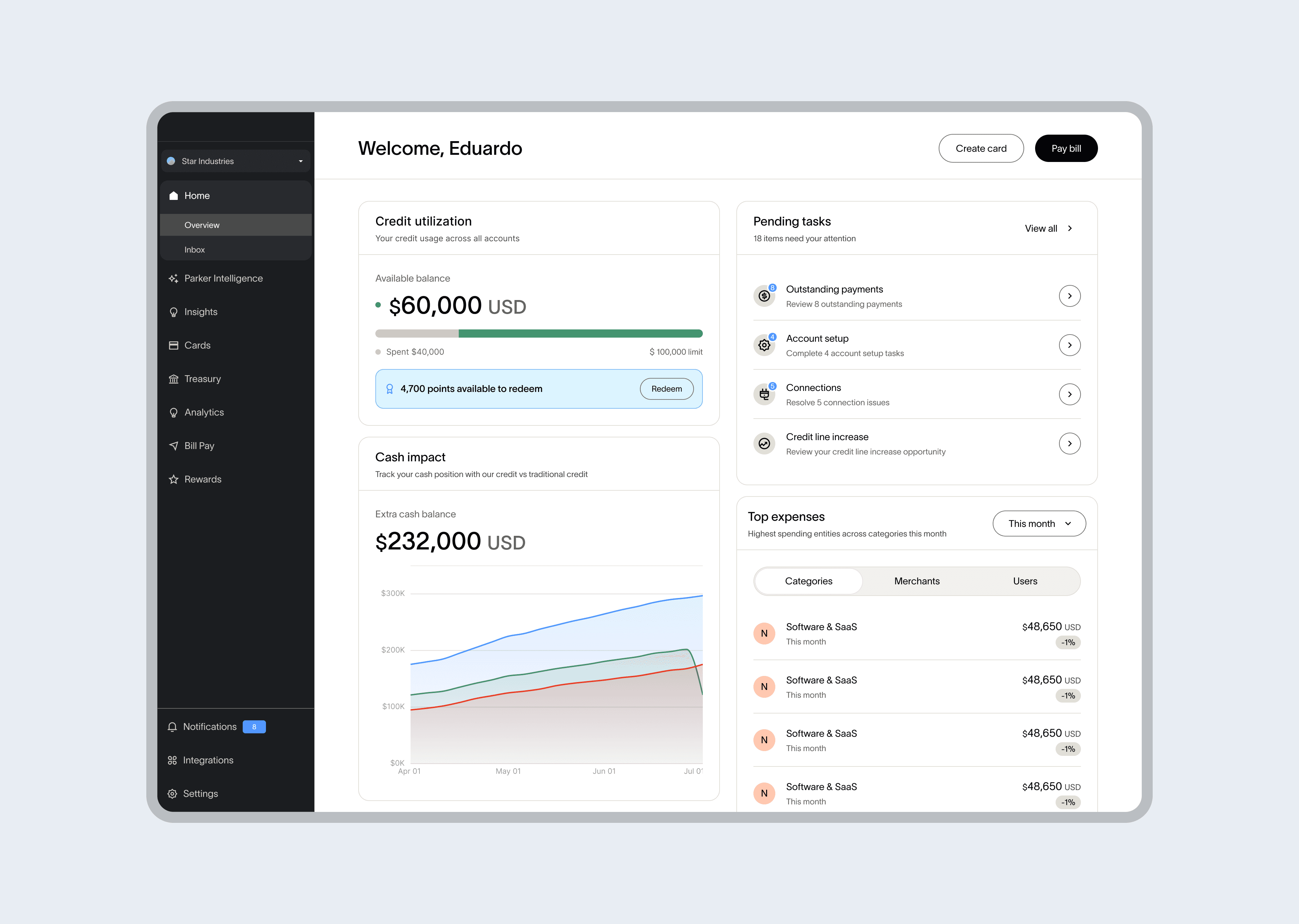
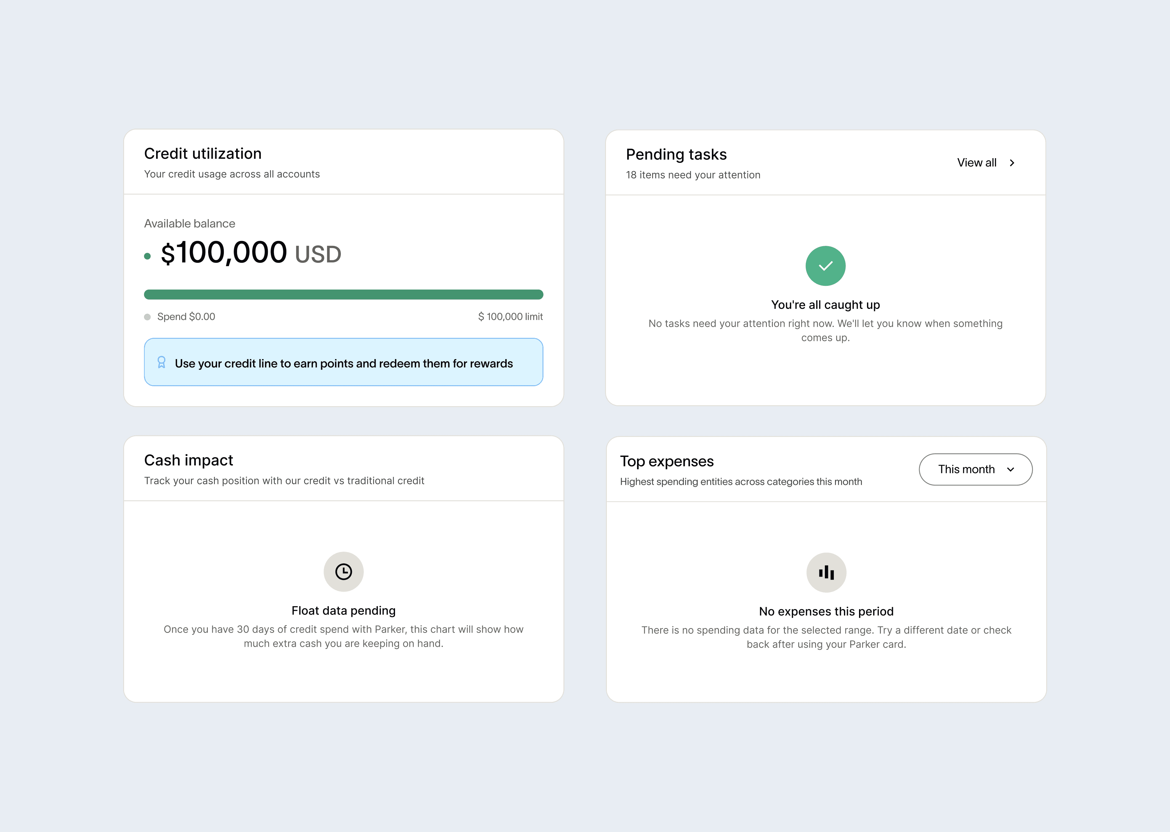
Credit limit and Pending actions
Credit utilization was the number one support inquiry on the platform, a visibility problem, not a product gap. Pending tasks lived in email. Both modules target action resolution rate directly: credit visibility eliminates support-driven logins, surfacing tasks gives founders a reason to act inside the platform instead of waiting for a notification.
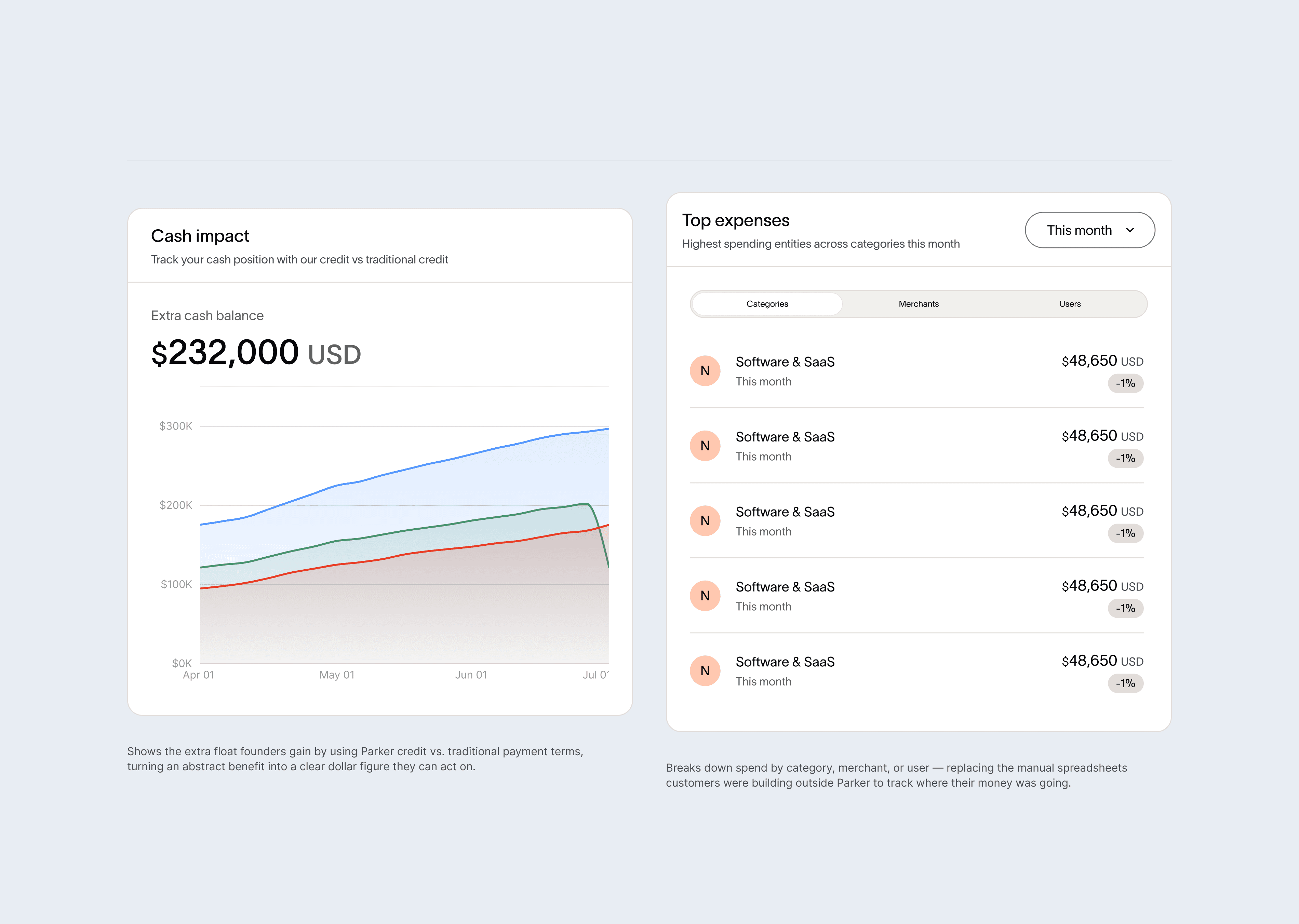
Float and Spend breakdown
Founders spending $25K to $50K per month keep an average of $34.7K more in daily cash through the platform's rolling terms, but that advantage was invisible. Float and spend are the primary drivers of multi-module session rate. A founder who checks both in one visit is using the platform to understand their business, not just check a balance.
Every label was a product decision:
Pending actions, not tasks or notifications. Pending implies something is waiting on the founder specifically. Actions implies it can be resolved right now.
Cash impact, not float impact. Early feedback showed founders didn't connect with "float" — a treasury concept, not founder language. Cash impact made the signal immediately legible without financial background knowledge.
Unlock your credit line, not apply for credit. Unlock frames the credit line as something already available to the founder, reducing the friction of what is functionally an application.
Designing for every user state
The first version worked well for active admins with spend history. But two questions surfaced during engineering review that reshaped the final design scope:
What happens to new users with no expenses?
What about debit-only users?
The starting point
We designed a progressive onboarding layer, "Get started", with three clear first actions that orient new users to the platform. The checklist disappears once they are set up. Modules load progressively as real data becomes available. The dashboard becomes a starting point, not a broken product.
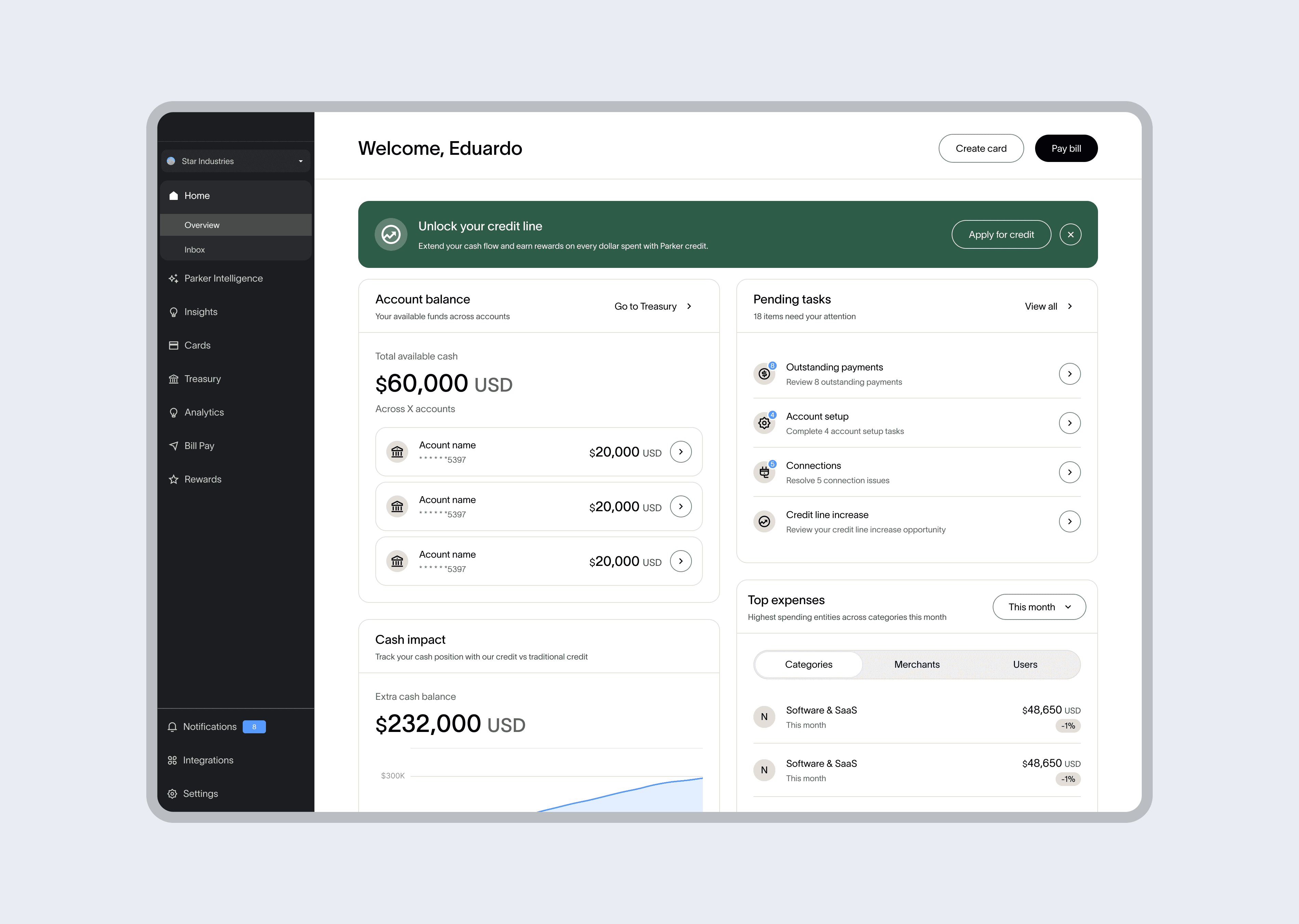
Debit-only users
Debit-only users — founders using the platform's banking and treasury features without an approved credit line — represented a natural upsell opportunity. Rather than showing them an empty or locked credit module, we surfaced a contextual "Unlock your credit line" prompt directly on the dashboard. The module becomes an upsell surface: it shows founders what the credit product can do for their cash flow, with a clear path to apply. The dashboard earns its keep even before the full product relationship begins.
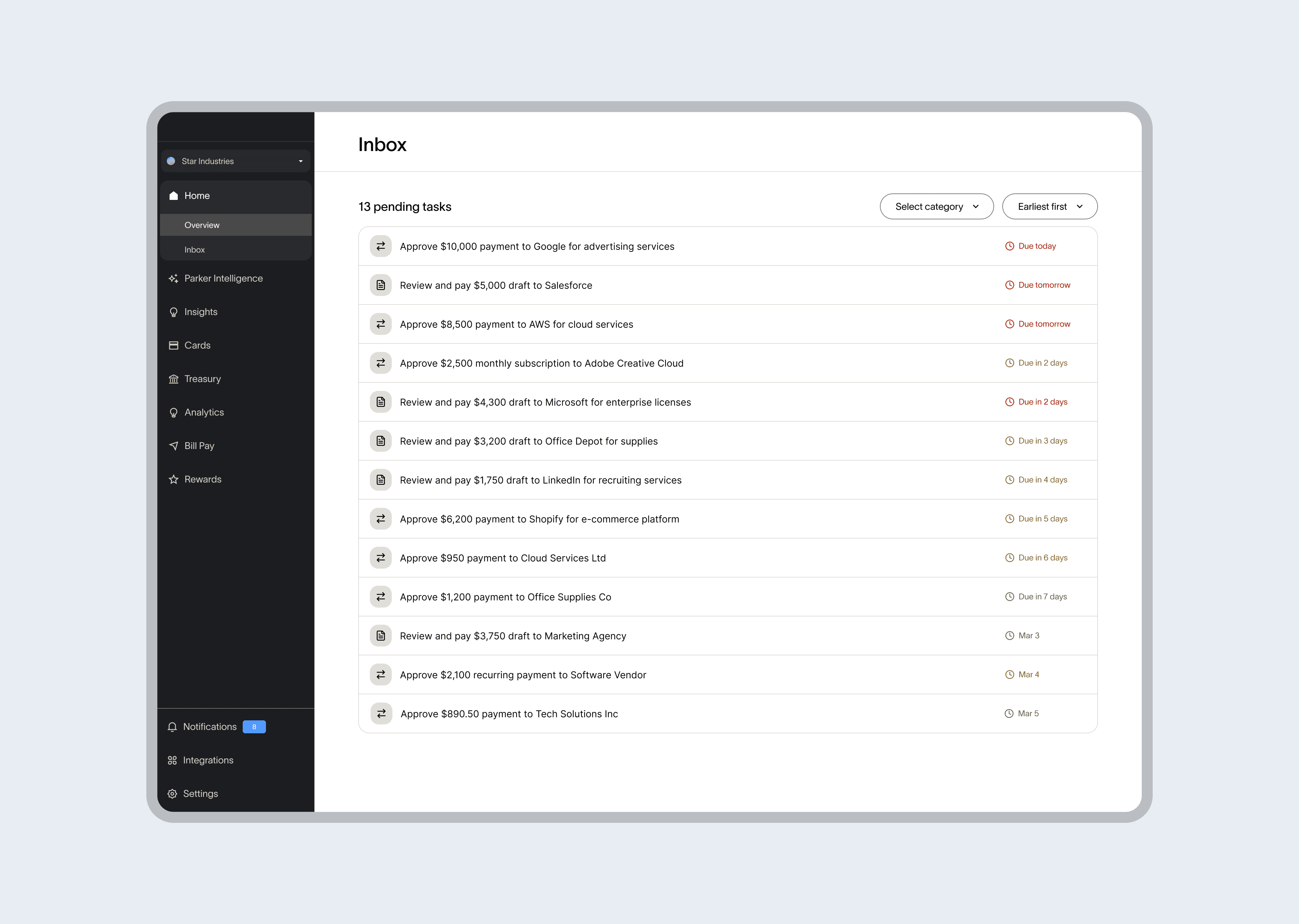
V2
the pending tasks module was always a bridge. We knew a dedicated approval queue was the right experience, but building it in parallel would have delayed the dashboard launch. The module shipped first, linking directly to wherever the action needed to happen. The inbox followed once the dashboard was stable.
Building the foundation
While building the home page, we identified that the existing design library wasn't supporting the new direction. Tokens, variables, and components were inconsistent, many had been custom-built for individual use cases with no shared patterns across the product.
We presented the gap to leadership and aligned it with an ongoing brand redesign effort. The decision: rebuild the foundation. Simpler, cleaner, scalable.
I partnered with the frontend team to map every component the home needed and split the work into two tracks: updating existing components to the new visual language, and building new ones from scratch. We connected Figma to the frontend environment through MCP — changes propagated to the codebase without manual handoff, keeping both sides in sync throughout the build.

The dashboard became the first surface shipped entirely on the new system. What started as a product project became the foundation for a platform-wide migration.
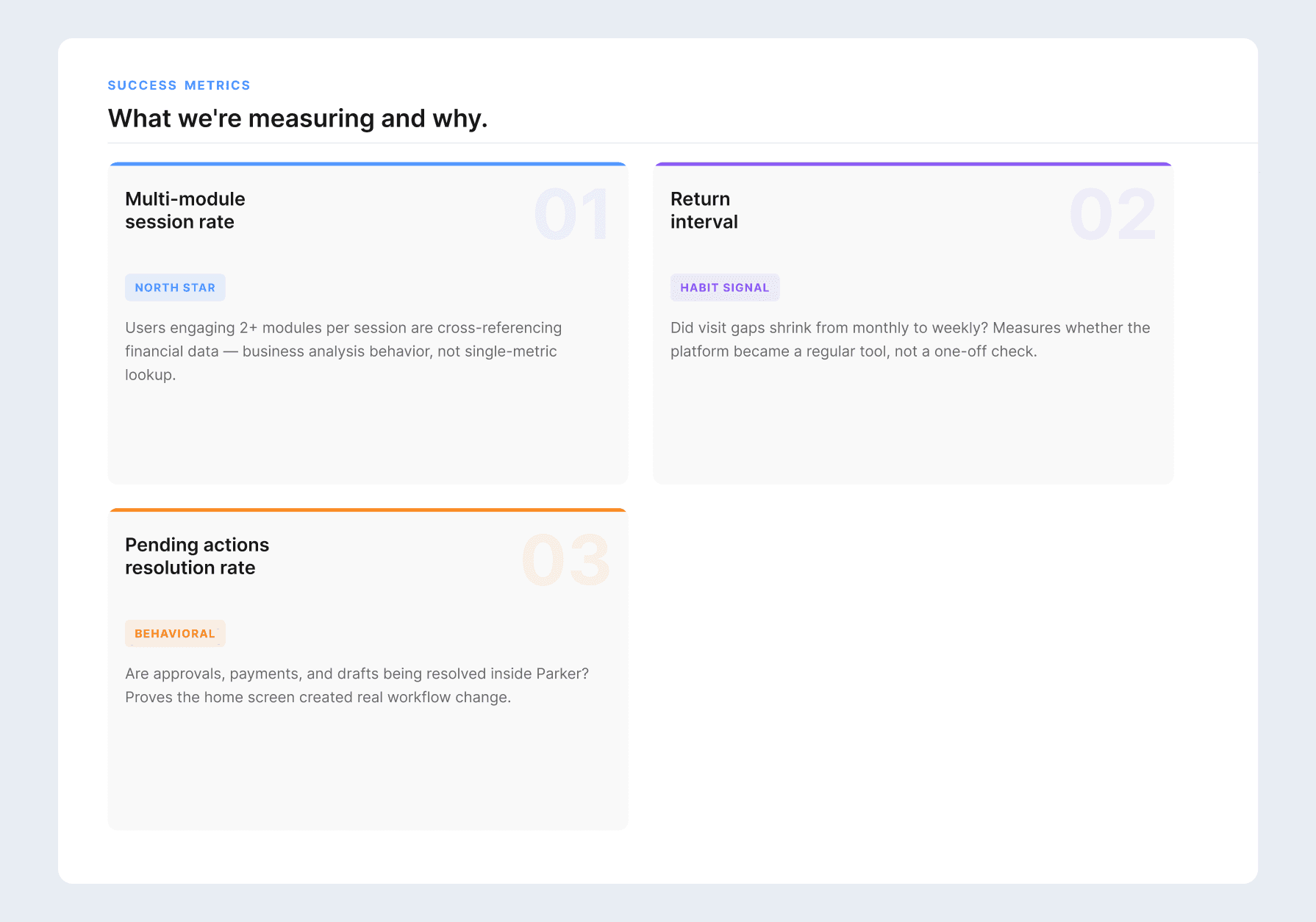
Choosing the right metrics to measure success
DAU was the metric that signaled the behavior, but not sufficient to measure success. A user could log in daily and still only check their credit limit. We wanted to prove founders are using the platform to analyze their business, not just check in. The following metrics were defined:
Outcomes
The initial rollout covered 20 founders across usage profiles. In a debrief with the Customer Success team following the rollout, three signals stood out:
Founders were understanding their financial position at login without navigating away from the homepage — for the first time.
Founders were reviewing and resolving pending tasks directly from the dashboard. Tasks had lived in email before. The homepage started replacing an external channel.
It became easier for founders to identify whether their team had something blocked — the information hierarchy and copy answered the right question: is there anything I need to do right now?
Learnings
Founders didn't need more data in the platform. They needed a starting point. A home that oriented them to their business made everything they already had actually useful.
© 2026 Eduardo Reyes